Shopping cart
Hello There!
Welcome to GattPrep, your Guide for Life and Learning
Have you ever taken part in a class vote or counted how many students bring rice for lunch? That’s data collection!
In this lesson, you’ll learn how to collect, organize, display, and interpret data using tables, charts, and graphs. These are tools that help us see patterns and make decisions. Whether it’s for school elections, sports scores, or survey results — data handling is a key life skill!
Data refers to pieces of information, facts, or numbers collected to study or analyze something.
We can collect data using:
This is a table that shows how often each item or category occurs.
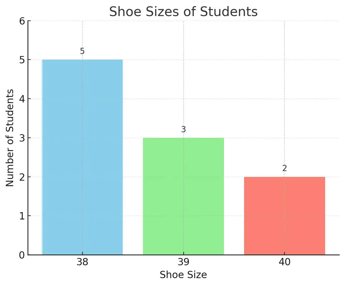
Example: Shoe sizes of 10 students: 38, 39, 38, 40, 39, 38, 38, 40, 39, 38
| Shoe Size | Tally | Frequency |
|---|---|---|
| 38 | |||| | | 5 |
| 39 | ||| | 3 |
| 40 | || | 2 |
Uses rectangular bars to represent quantities. Heights of bars match the frequency.
Bar chart showing shoe sizes (x-axis) and number of students (y-axis)

Uses pictures or symbols to represent numbers. A key shows how much each symbol is worth.
Example: Number of books read by students:

A circle divided into sectors. Each sector shows the portion of a category.
Example: Favourite fruits among 30 pupils: Mango (12), Orange (9), Banana (6), Apple (3)
Each fruit’s angle =

Used to show changes over time. Points are plotted and connected with straight lines.
Line graph showing rainfall over 7 days (x-axis = days, y-axis = mm of rain)

Question: The marks scored by 8 students in a quiz were: 4, 6, 4, 5, 6, 7, 6, 5
Solution:
| Mark | Tally | Frequency |
|---|---|---|
| 4 | || | 2 |
| 5 | || | 2 |
| 6 | ||| | 3 |
| 7 | | | 1 |
Question: A bar chart shows students who play these sports: Football (12), Volleyball (8), Basketball (5).
Which sport is least played?
Answer: Basketball (5 students).
Question: Out of 40 students: 20 prefer rice, 10 like yam, 10 like kenkey.
Find the angles for each sector of the pie chart.
Part A: Frequency Table
The number of goals scored by a team in 7 matches: 2, 3, 1, 2, 3, 0, 1
Draw a frequency table to organize this data.
Part B: Pictogram Interpretation
Each 🏀 = 5 players
How many players in Class C?
Which class had the fewest players?
Part C: Pie Chart Angles
In a survey of 60 students:
Find the angle for each sector.
Part A:
| Goals | Frequency |
|---|---|
| 0 | 1 |
| 1 | 2 |
| 2 | 2 |
| 3 | 2 |
Part B:
Part C:
In this lesson, we explored how to collect, organize, and present data.
You learned about frequency tables, bar charts, pictograms, pie charts, and line graphs.
These tools help us understand data better and make smart decisions.
Think of a question you could ask your classmates, like “What’s your favorite school subject?”
How would you collect and display the answers using a table and a chart?
Sketch a rough version on paper to practice.