Shopping cart
Hello There!
Welcome to GattPrep, your Guide for Life and Learning
Have you ever seen colourful charts in newspapers or social media? They’re not just pretty pictures—they tell powerful stories about data! 📈📊
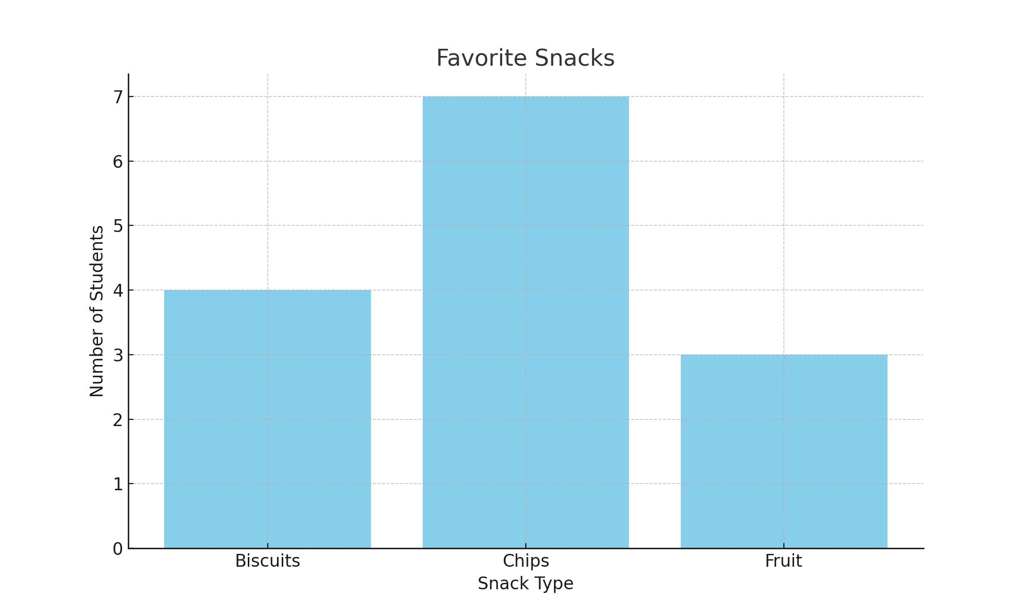
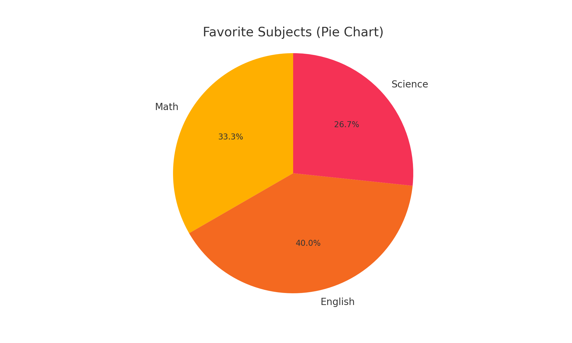
In this lesson, you’ll explore three of the most common ways data is visually represented: bar charts, pie charts, and histograms. These tools make it easy to understand large amounts of data at a glance—whether it’s student test scores, survey results, or sports statistics. 🏀🎓
Example Uses: Number of students in different classes, favorite fruits, etc.
✅ Bar chart:

✅ Pie chart:

✅ Histogram:

Have you seen any data visualizations on TV, in newspapers, or on social media? Could you tell whether it was a bar chart, pie chart, or histogram? Why do you think visuals are often used instead of tables or numbers?